Grotesque Anatomy
Friday, January 02, 2004
Comics From The Future
Ah, 2004. A brand new year. A fresh slate. What better time to try to figure out what comics I might want to read in March? Yep, it's time for a quick rundown of stuff that caught my eye in the latest Previews (for comics shipping in March 2004):


Someone needs to give Michael Turner a book on basic human anatomy. His version of Wonder Woman is just wrong. Her face looks especially misshapen. Hint: Her ears should not be sliding off the sides of her head.
The Marvel Previews supplement is a strange, strange beast. First there's the fact that I can't escape Spider-Man's crotch swinging at me: It's coming at me spread-legged on both covers. Then I notice that this installment of MP leads with the same sample as last month's--a preview of the new series by the Ultimate Spider-Man team of Brian Michael Bendis and Mark Bagley, The Pulse. OK, this time around there were more pages, plus actual dialogue (more of, um, you know--wow--Bendis' stammering dialogue, yeah). And it does give a better idea of the basic premise of the series: J. Jonah Jameson, faced with declining sales of his newspaper, decides to give the public what it wants: More superheroes (much like Marvel Comics itself). But they still can't get Curt Connors' last name spelled correctly in the mock article on page two (last month it was spelled 'Connars'; this month it's 'Conners'; at least they get it right in the solicitation for Spectacular Spider-Man on page 8). For another example of sloppy laziness, check out the text used in the "historic" newspapers framed in Jameson's office: It's the same copy used from the Bugle article on the splash page.
In her Snarky Comments section, Johanna has commented on the unintentional humor of Ultimate FF #4 being billed as Susan Storm focused while the cover features the Thing, but wouldn't it be a hoot if that was Sue Storm on the cover? Wasn't there an old What If...? where Sue became the Thing?
Yikes! Looking at the preview art for Captain America & The Falcon, I can see why Bart Sears' art was a dealbreaker for this book with Graeme McMillan. For one thing, Cap's thighs are twice as big as his head. I guess this proves that the Super-Soldier Serum was a steroid after all. (I had scanned an image, but my PC lost it in the transfer from scanner to software, and I'm too lazy to rescan it. I'm sure the image will turn up online soon enough.)
Finally, if Marvel is going to insist on using "The House of Ideas" tagline on the cover to Marvel Previews, they could at least be honest about the fact that the ideas are all endlessly recycled ones.
So what else are others looking forward to and/or dreading?
Ah, 2004. A brand new year. A fresh slate. What better time to try to figure out what comics I might want to read in March? Yep, it's time for a quick rundown of stuff that caught my eye in the latest Previews (for comics shipping in March 2004):
 STEVE
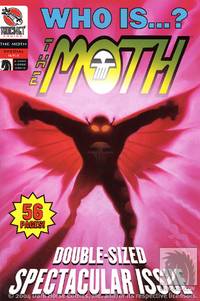
RUDE'S THE MOTH. As
previously noted, I am very much looking forward to this
comic. I wasn't aware it had been adopted under the Rocket Comics banner,
though. (Or at least it appears that way in Previews,
if not on the Dark Horse website.) What, doesn't Steve "The Dude"
Rude rate a "Legends" ranking?? Or doesn't Dark Horse run that
imprint any more? Maverick? Comics' Greatest World?
- CASTLE
WAITING: THE LUCKY ROAD Never read it, but I've always
enjoyed Linda Medley's artwork. Johanna
raves about this series, so I may break down and try the first volume.
- EISNER/MILLER
TPB - An interesting idea, but I don't feel like I have a good
grasp of what this book is going to be like. Is it just a
transcript of one long conversation between Miller and Eisner? I
still haven't finished the TCJ collection of Frank Miller interviews,
so
I probably shouldn't be buying another book that sounds interesting but
will sit unread/unfinished.
- MICHAEL
CHABON PRESENTS: THE AMAZING ADVENTURES OF THE ESCAPIST #2 -
Maybe,
depending on what #1 is like.
 KINETIC
#1 - Maybe. The preview
looks interesting, especially Warren Pleece's art and the trichromatic
coloring.
- JLA #94 & 95 -
Curiosity...overwhelming...common
sense...
- SWAMP THING - Maybe, or wait for the trade/bargain bin.
- BATMAN POISON IVY: CAST SHADOWS This interests me because
of Ann
Nocenti, but
I hate "Prestige Format" books, especially when they cost $7.
- BATGIRL #50 caught my eye, mainly due to the
striking
James Jean
cover. Has anyone been reading this series? Is it any
good? I know nothing about the current Batgirl. Maybe I'll
check this out as an opportunity to research a corner of the DCU I know
little of, and as an experiment in trying a series cold fifty issues
in..
- DOOM PATROL ARCHIVES VOL. 2, although I'll probably wait
to see
if I can
find it
used.
- BARAKA
&
BLACK
MAGIC IN MOROCCO (Alternative Comics) - I still haven't managed
to
finish Smith's Shuck Unmasked (the phonetized
dialect-speak is
extremely tedious to slog through), but the art for this book looks
striking, and
it apparently employs normal English, which is a plus.
 STREET ANGEL from
SLG sounds like wacky fun:
"An evil geologist plans to re-Pangeaify the earth’s continents, annihilating civilization as we know it and elevating him to godhood. With time running out, a corrupt Mayor reluctantly turns to his nemesis, Street Angel, to save mankind. But what chance does a 13-year-old homeless girl stand against a mad genius and his army of henchninja? Don't miss THE martial arts and skateboarding bonanza of the year! Bruce Lee meets Dan Clowes crossed with Watchmen, if Tony Hawk and Clint Eastwood had a child, and the Matrix crossed with Punky Brewster, pre-Algebra, and your mother! Must be seen to be believed! Gorgeous"
And I love that cover. SBC already has a positive review of the first issue. [UPDATE: Missed this before, but CBR has a lengthy interview (including plenty of sample images) with Street Angel's creators, Jim Rugg and Brian Maruca.]- RADIOACTIVE MAN: THE MOVIE ADAPTATION (Bongo) - I
haven't
read a
Simpsons
comic since the Futurama crossover, but this sounds like it could be
fun.
- HINO HORROR VOL 1 GN THE RED SNAKE. I'd
never heard
of Hideshi Hino but the description of
this manga book sounds interesting:
"Something evil lurks within the house. It is in the rooms that no one enters, it is in the forest that is all around, and it is in the minds of the people that live there. Only when a red snake appears does the evil manifest itself, unleashing horrific events that end in a bloody orgy of murder and mayhem."
The sample art on DH Publishing's site looks suitably disturbing, yet also charming in its own way--kind of like a cross between Suehiro Maruo and Richard Sala--so I may check this out.  VAN
HELSING'S NIGHT OFF (Top Shelf) could be fun, but I'd need to
see
some actual samples from the book before I'll preorder it.
- BANANA FISH is being re-released in a second, cheaper
edition
from Viz
($9.95 vs. $15.95). I've heard of this series before (it was
serialized in Viz's late Pulp anthology), but I never
realized it was
classified as a shojo manga (not only that, but "the most popular shojo
(girls') manga of the 80s" according to Viz's
site). This
site claims it was "popular with young women because of the
attractive male characters, who look really cool." I have much to
learn when it comes to manga.
- BACK
ISSUE
#3
- Not sure. I wasn't that impressed with the first issue of this
comic book magazine, and I don't see much that interests me in the
contents for this issue. Probably a pass.
- COMIC BOOK ARTIST VOL 2 #3 - I have been enjoying the revamped CBA, on the other hand, and this issue looks like another winner with an extended Darwyn Cooke interview.


Someone needs to give Michael Turner a book on basic human anatomy. His version of Wonder Woman is just wrong. Her face looks especially misshapen. Hint: Her ears should not be sliding off the sides of her head.
The Marvel Previews supplement is a strange, strange beast. First there's the fact that I can't escape Spider-Man's crotch swinging at me: It's coming at me spread-legged on both covers. Then I notice that this installment of MP leads with the same sample as last month's--a preview of the new series by the Ultimate Spider-Man team of Brian Michael Bendis and Mark Bagley, The Pulse. OK, this time around there were more pages, plus actual dialogue (more of, um, you know--wow--Bendis' stammering dialogue, yeah). And it does give a better idea of the basic premise of the series: J. Jonah Jameson, faced with declining sales of his newspaper, decides to give the public what it wants: More superheroes (much like Marvel Comics itself). But they still can't get Curt Connors' last name spelled correctly in the mock article on page two (last month it was spelled 'Connars'; this month it's 'Conners'; at least they get it right in the solicitation for Spectacular Spider-Man on page 8). For another example of sloppy laziness, check out the text used in the "historic" newspapers framed in Jameson's office: It's the same copy used from the Bugle article on the splash page.
In her Snarky Comments section, Johanna has commented on the unintentional humor of Ultimate FF #4 being billed as Susan Storm focused while the cover features the Thing, but wouldn't it be a hoot if that was Sue Storm on the cover? Wasn't there an old What If...? where Sue became the Thing?
Yikes! Looking at the preview art for Captain America & The Falcon, I can see why Bart Sears' art was a dealbreaker for this book with Graeme McMillan. For one thing, Cap's thighs are twice as big as his head. I guess this proves that the Super-Soldier Serum was a steroid after all. (I had scanned an image, but my PC lost it in the transfer from scanner to software, and I'm too lazy to rescan it. I'm sure the image will turn up online soon enough.)
Finally, if Marvel is going to insist on using "The House of Ideas" tagline on the cover to Marvel Previews, they could at least be honest about the fact that the ideas are all endlessly recycled ones.
So what else are others looking forward to and/or dreading?